12 pt Fournier Italic


12 pt Fournier Italic
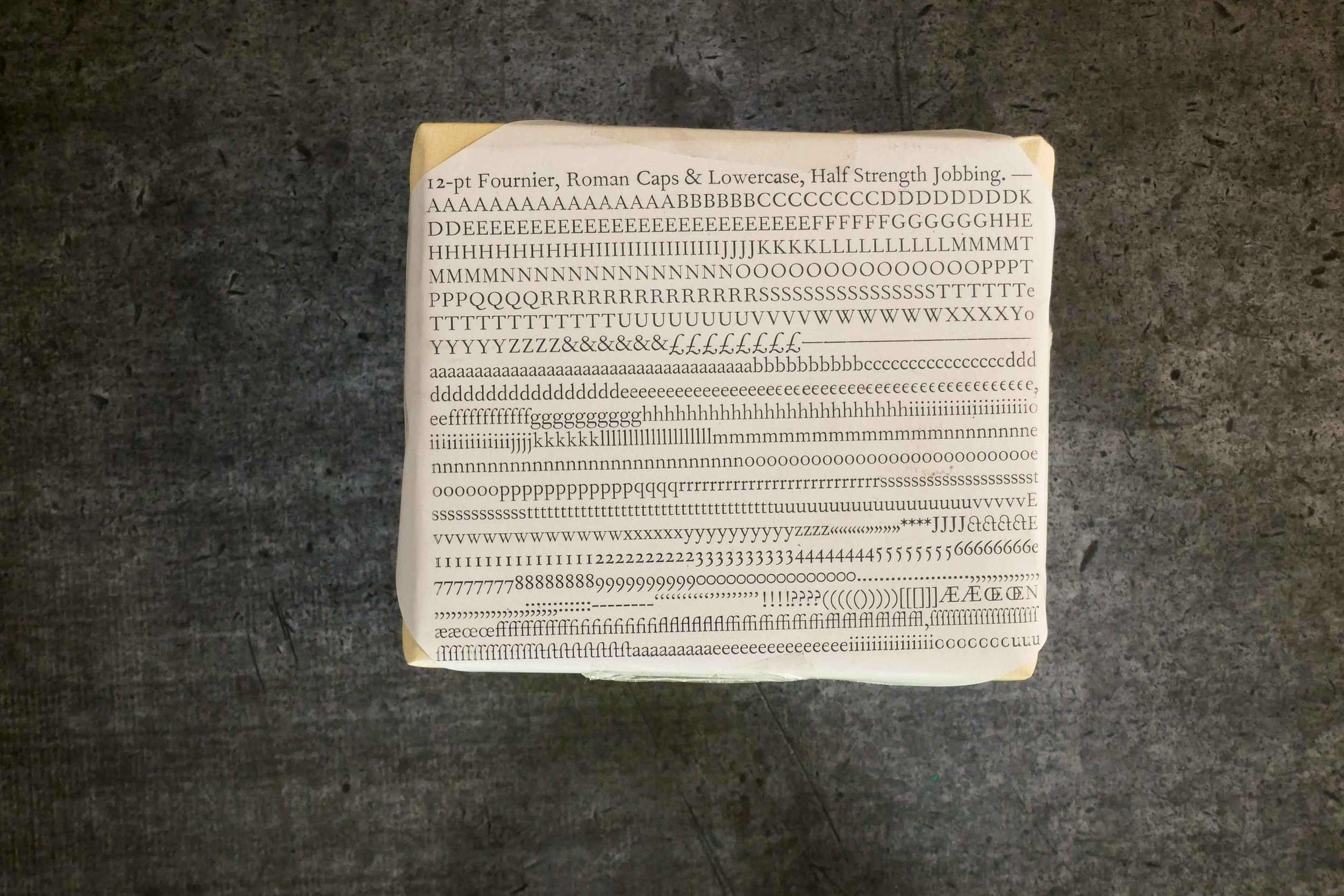
Fournier (series 185) — Half strength jobbing
The roman and italic types cut by Pierre Simon Fournier (Fournier-le-jeune) midway in the eighteenth century have the freshness and interest which is so often found in those periods of design and decoration which are called 'transitional' that is, works produced by an ingenious mind working towards a new style yet still drawing nourishment from the old.
Fournier, born in I712, was the son of the manager of the ancient Le Bé type-foundry. He was first employed by his brother to cut woodblocks and headpieces and he later turned to engraving punches and designing his own types. Besides being the author of the famous Manuel Typographique, his many activities included experiments with music type-cutting, efforts to establish a universal point system, and researches into the history of type-cutting. Fournier's types, which simplified many features of old face without attempting the sharpness of cut of the Didot-Bodoni school, were largely responsible for accustoming the eyes of educated readers in France and elsewhere to the sharper and more logical letter design introduced by the Imprimerie Royale at the beginning of the eighteenth century.
Series 185, cut in 1925, is a facsimile version of one of the medium text types cut by Fournier in 1745. It is sharper and more open than the old face types and is fairly light in weight. Its comparative narrowness makes it a useful face for lengthy texts but, although primarily a book face, it has been used effectively in a wide range of jobbing work, where its delicacy and precision of cut can be shown to advantage. The italic, influenced by the handwriting of the day, is decorative and has unusual figures. The capitals of Series 18; are especially tall and bold in relation to the lower-case and the alternative shortened capitals (Series 285), originally cut for the first Nonesuch Press Shakespeare.

